500 years printing x (science + art) = cartography
In European culture few mediums, if any, can compare with the practice of cartography as a combination of the discipline of science allied to the expression of art. Within a few years of the earliest publications of Gutenberg and Caxton, woodblock cutters and copperplate engravers were grappling with the challenge of illustrating the world on paper and conceptualising the most recent discoveries within the context of classical geographical theories. Market needs demanded a visually satisfying presentation for the maps, or atlases – a requirement that remains today just as it did 500 years ago.
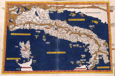
The earliest map publications, produced around 1480, derived from the theories of Claudius Ptolemy, whose “Geographia Tabula”, in which more than 8,000 places were identified with their mathematical co-ordinates, provided the basis for the set of 27 maps of the ancient world. These 27 maps were really the world as known in Roman times, and were reprinted in numerous different forms between 1477 and the eighteenth century. Despite their cold statistical origins and the lack of sophistication in early engraving techniques, many of these early maps demonstrate the enthusiasm with which the artist-engraver would approach the discipline of illustrating where one place was in relation to another.
At the same time cartography was developing through two other map forms – the scripturally based Mappamundi with Jerusalem at the centre surrounded by medieval interpretations of the classical concepts; and, the portolan chart, precise regional plotting created solely for the use of mariners. Although predominantly manuscript rather than printed in production, many of the artistic devices seen in these works found their way onto the printed map. The woodcut maps of Lienhart Holle’s “Geographia” of 1482 and 1486 are renowned for their boldly engraved lines. They are often-found in fine strong contemporary colour and include the first printed map to be signed by the woodcutter, Johannes from Armsheim, south-west of Mainz. Only one, the world map, of this series has any decorative features – a surrounding design of chubby-cheeked windheads set against a cloud puffed sky. Such windheads, seen subsequently most often on sea charts, were used as both artistic devices and as indicators of the prevailing winds.

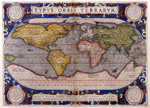
Over the course of the sixteenth century Europe’s cartographic industry developed from having an over-riding interest in the classics to become a scientific study reporting the latest discoveries, while also charting and delineating the home countries of Europe and other known parts of the world. Abraham Ortelius’ atlas, “Theatrum Orbis Terrarum”, is considered the first modern world atlas. First published in 1570 this collection of up-to-date maps of all areas of the world was engraved on copper and utilised numerous artistic features to enhance the maps' appearance. Along with bizarre and fiercesome sea monsters, mythical sea-gods and mermaids, illustrations of local animals and birds, title cartouches might also be decorated with local agricultural produce – grapes on the maps of Burgundy, or oranges on the map of Seville, for instance.

Besides performing a decorative function on the map, much of the illustration served a documentary purpose, often providing Europeans with their first images of foreign life. This was especially true of the furthest flung parts of colonial reach where, for instance, the illustrations of the artist explorer John White provided the first pictures of Virginian Natives and their lifestyles, or those from Hugo van Linschoten’s travel accounts in India and South East Asia.
John White’s illustrations were published in Theodore De Bry’s “Grands Voyages” and this, with the Linschoten work proved amongst the most influential in the dissemination of images of the New World. The world map from the latter, designed by Petrus Plancius, and engraved by Jan van Doetechum, is acknowledged as the first world map to use illustrations representing the newly discovered parts of the world as decoration. The double-hemisphere world map is supplemented with a double hemisphere celestial sphere and animals, people, their habitations, and major landmarks of each continent are shown. The engraving is a fabulous combination of documentation and artistic style.
Throughout the seventeenth century many of the images from this period provided the staple stock of vignette and border illustrations for maps and charts. The carte-a-figure style of map presentation utilised side panels depicting peoples of the region shown. Along the map’s top, and sometimes bottom, borders of oval or rectangular views of major cities or ports were also shown. In Amsterdam, the centre of European cartographic output, Pieter van den Keere, Claes Janszoon Visscher, Willem Blaeu, Henricus Hondius, and Frederick de Wit were the most prominent practitioners of the art of the illustrated map, while French and English copies, most notably those maps of John Speed, testify to the popularity and usefulness of such carte-a-figure maps.
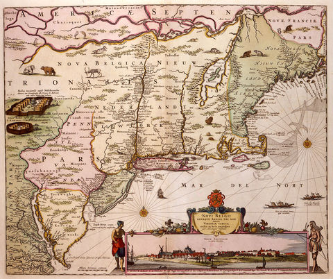
In addition to the decoration around the border of the map, vignette illustrations on land and sea, and decorated cartouches around titlepieces, scale bars and explanatory keys might be seen. Besides mythological figures and fantastic creatures such illustrations might feature scenes of local industry, agriculture, habitations and so on. A renowned example is seen in the series of maps of New England published from 1651. Here the Amsterdam publisher, Jan Jansson, shows the latest cartographic knowledge of the region dotted with vignette illustrations depicting Native American encampments, numerous animals and birds, including a beaver and turkey, and figures paddling a canoe. To this basic map Nicolas Visscher added a panoramic view of New Amsterdam in 1655 with native Indians at each side. Later, other publishers, having enhanced the view with the addition of new buildings, designed an elaborate figured “Restitutio” cartouche to celebrate the Dutch re-capture of New York in 1673. As such, Tony Campbell in his monograph on these maps describes them as, “a valuable historical source and as evocative a picture as any we have”.

The highlight of baroque cartography is seen in the series of charts designed by the master engraver Romeyn de Hooghe for Alexis Hubert Jaillot’s “Neptune Francais …”. These charts supplemented the Jaillot’s own maps as a new edition, on enlarged scale, of the work of the renowned French cartographer Nicolas Sanson. The originals, published around 1650, were folio size, detailed where possible, but plain in their execution. Jaillot’s training as a sculptor is evident in these newly engraved plates in elephant folio, with large ornate illustrated cartouches, often published with full wash colour and heightened with gold. The series prompted the carto-historian Sir George Fordham to call such maps “the finest specimens extant of this decorative art.” Such was the popularity of this series that the plates were re-engraved for publication in Amsterdam with the addition of a supplement of sea-charts including several of the western European coasts designed and etched by the famous Dutch artist Romeyn de Hooghe. The charts are finely worked and include a wealth of navigational detail, soundings, anchorages, inset plans of ports and harbours and so on, all presented in ornate flamboyant and elegant multi-figured surrounds. The highlight of the group is the detailed large chart of the Mediterranean which has no less then 38 inset plans and views of ports and harbours from Tenerife to Constantinople.
Around this time, a specialisation developed in the production of the printed map. Previously one engraver would have been responsible for all elements of the copperplate’s working, however, we now see a separation in the skills. The cartographic detail would be engraved by one hand whilst an artist engraver, or etcher, might provide the cartouche, vignettes, and decoration.
Eighteenth century cartography shows increasing sophistication in mapmaking technique with large scale, very detailed surveys being made of many areas of Britain, Europe and the colonial countries. The culmination of such projects was, of course, the establishment of the now familiar National Surveys in most countries producing maps which, although lacking in decorative features, exhibit immense skill in their production and finesse in their engraving and printing processes. Now, digital and computer generated cartographic images make artistic involvement unnecessary but the principles of creating a clear and easily read map which also looks attractive still prevails.
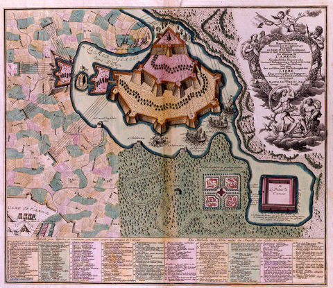
Hand in hand with the increased output of large scale maps the publication of detailed, multi-sheet town plans saw many superb productions. In England the foremost practitioner was the Huguenot emigré, Jean Rocque, whose 24 sheet map of London and Westminster, 16 sheet map of London and Environs, and two and four sheet maps of other major cities, including Bristol, Exeter, Brighton, Shrewsbury and others, were finely engraved and ornately designed, often with inset views of major buildings and landmarks. The 20 sheet plan of Paris by Louis Turgot in 1740 shows the buildings in profile so the impression is of a “birds-eye” view of the city. Such maps were intended as wall decoration and, with engraved framework borders, would have been mounted on canvas with wooden rollers at top and bottom. Maps as decorative wall hangings, of the world, continents and countries, had been produced in the seventeenth century, as shown in the paintings of the Dutch master Vermeer, but none compare in size and grandiose concept with these town plans.
Maps are, invariably, thought of on paper, folding, hanging on a wall, or bound in atlas form of perhaps very large, or, pocket-size format. However their use broadened during the late eighteenth century so that they might be seen, in contorted form as satirical characters or representing fantasy lands such as “Utopia”, “The Land of Love”, “The Crossroads of Life” and so on. The growth of popular tourism also prompted a further use of maps as decoration on souvenir trophies – on china, woodwork trinkets, and fans.

As a counterpoint to the strictly scientific approach of nineteenth and twentieth century mapmaking a new genre of cartographer has developed, one whose emphasis is on art and illustration as opposed to documentation. Commercial concerns, such as “The National Geographic Magazine”, use artists to enhance the visual and educational impact of their maps. Others, such as London Transport, have employed artist illustrators like MacDonald Gill, to create poster maps to advise and advertise their services. In fact, certain artists, in admittedly abstract form, have turned the map into an artwork and, in contrast to the precision and science of the National Survey, have produced works in which the map is solely a picture. Jasper John’s various works of the 60’s entitled “Map” are paintings showing the United States, while maps in abstract form now provide the basis for innumerable advertisements and items of merchandise.
If science is defined as a systematic and formulated study of knowledge and art as a skill applied to imitation and design, then the work of the cartographer, over 500 years, represents a perfect amalgam of these disciplines.


